Greg, Nick, and I made a trip to Lowe's last week to choose paint colors and get a head start. Nick absolutely loved the racecar carts, and was happy to sit and steer the whole time we debated colors.
My inspiration for colors came from this rug and this rug at JCPenney. Not sure if I'll use one of these rugs or a different one (more about that in another post), but the green and chocolate go well together with the blue as an accent, I think.
We brought home four colors to choose from, and Greg painted the sample colors on the walls to see how they'd look. You can see two of them on the wall behind the couch in the pictures below. We're thinking of putting a chocolate brown color on the wall behind our couch, and then doing a shade of green everywhere else. The darker color is called Pine Bark, and the lighter color is Rolling Stone.
And here's a close up. . . (Sorry, it's hard not to get the flash in the wrong spot.)
When we moved into our house back at the end of 2006, the whole downstairs was decorated largely in country blue, with floral wallpaper (an older lady lived by herself here before us). While the color and wallpaper are not hideous, the whole downstairs certainly isn't our style. We always intended to redecorate, but life kind of got in the way. This year, though, we are determined. Once you put up the paint samples, I think, you have to be pretty committed to actually painting. ;)
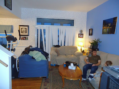
Here are some more pictures of our current living room. Basically, all of the walls except for the dark blue one behind the couch will be some shade of green. The trim and the ceiling will stay white. The only question is which shade of green to go with. I should add that this space gets a lot of light during the day, so we're afraid if we go too light with color, it will look washed out. (That's what the paint specialist at Lowe's said, anyway.) We'll be looking for another way to make the room brighter at night. (Recessed lighting, perhaps, or track lighting?)
Here are the two shades of green we're thinking about. We love the darker green, called California Roll, but we're worried that it may be too dark. The other green, Shade Green, is pretty but might not have enough green in it for us.
Greg's job in the next few weeks is going to involve lots of time on a ladder, getting intimate with the subject of wallpaper removal. Oh, and yes, we are aware that our blinds need to be replaced. We were thinking two layers of drapes, see-through white ones and some thicker ones that could be closed in the winter.
Part of the challenge of this space is that our living and dining rooms are completely connected. So the whole space has to be done in the same color scheme. Our couches will stay, since they're brand new. They look a little funny in these pictures because they have covers on them to cut down on the cat hair. Under the covers, they're all a slightly darker shade of tan.
So, what do you think? Should we go with the brighter colors or the more washed out colors? Or is this color scheme not going to work in our space? Is it crazy to want a dark accent wall the color of chocolate, Or will it make the room really pop? Sigh. Decisions like this are hard.


No comments:
Post a Comment